
—
Projeto
Foi dado um trabalho para realizar uma criação de Logotipo para um Personal Trainer. Ele já estava bem ciente com suas ideias sobre o que queria e como queria. Fizemos algumas sessões de brainstorming juntos para tirar o máximos de ideias e caminhar no mesmo sentido quanto a Logotipo dele. Um ponto que ele teria certeza neste trabalho seria a Tipografia. Ele queria algo mais moderno/futuristico. Propus para ele uma Tipografia em que podemos usar quanto no Logotipo e em seus materiais gráficos. Depois de alguns testes, nós batemos o martelo na Tipografia Blender. Ela é um tipo Sans que tem uma pegada mais forte e formas mais moderna. O cliente veio com outra ideia de adicionar icones junto com a sua Logo. Seria algo bem clichê ter o Nome do cliente e icones por cima de sua logo, por isso eu vim com a ideia de fazer a junção da tipografia com os icones.
—
Project / English
I have been given a project to create a Logo for a Personal Trainer. He was already well aware of his ideas about what he wanted and how he wanted it. We did some brainstorming sessions together to get the most out of ideas and move in the same direction to the creating of the Logo. One point that he would be sure of in this project would be Typography. He wanted something more modern / futuristic. I proposed to him a Typography in which we can use as much in the Logo and in its graphic materials. After a few tests, we hit the hammer with Blender Typography. It is a Sans type which has a stronger grip and modern forms. The client came up with another idea of adding icons along with his Logo. It would be a bit of a cliché to have the client's name and icons on top of your logo, so I came up with the idea of merging the typography with the icons.

—
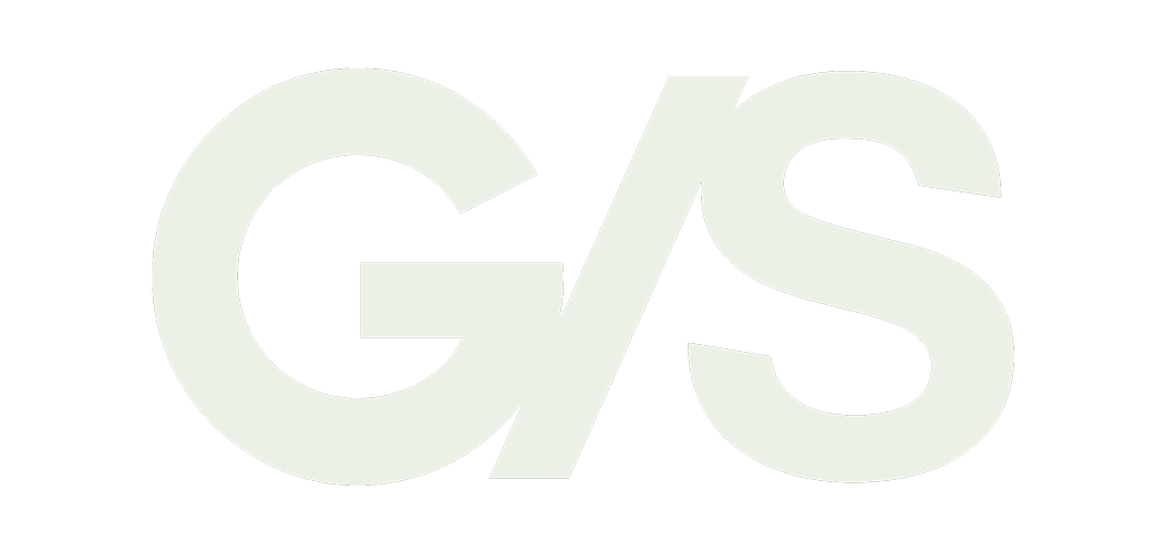
Logotipo Final
Aqui nós temos o trabalho final deste projeto. Podemos ver claramente a junção dos icones e tipografia. A tipografia joga uma grande parte pois ela passa um tom de força e impacto para seu clientes. O futuro cliente poderá observar a logo e ter o sentimento que este Personal Trainer é uma pessoa focada que te dará resultados sem mimimi.
—
Final Logo / English
Here we have the final work for this project. We can clearly see the combination of icons and typography. Typography plays a big part because it gives a tone of strength and impact to your customers. The future client will be able to observe the logo and have the feeling that this Personal Trainer is a focused person who will give you results without the BS!

—
Conceito
O conceito que o cliente deu era mostrar dois icones. Um ele já tinha em mente que seria o icone do Haltere. O segundo icone ele já não tinha ideia do que seria. Após fazermos alguns brainstorming nós decidimos em um icone que representasse a queima de gordura do seu cliente. Com isso nós fechamos em um raio que significa intensidade. Várias Logos no mercado possuem a tipografia e icone na parte superior. Isso é algo bem comum e clichê então tive a ideia e juntar a tipografia com os icones. O Logotipo possui duas palavras, Marcos Loures. Foi colocado um icone em cada palavra para ter uma certa igualdade e estabilidade no Logotipo. O "CO" no Logotipo foi escolhido para ser o Haltere pois são duas letras redondas que possuem o formato de um Haltere, fazendo alguns ajustes eu consegue dar a impressão de um Haltere quando visto. O Raio foi colocando entre e E e o S pois é onde ele se encaixou melhor.
—
Concept / English
The concept that the client gave was to show two icons. One he already had in mind that would be the dumbbell icon. The second icon he had no idea what it would be. After doing some brainstorming we decided on an icon that represented your client's fat burning. With that we close in a radius that means intensity. Several Logos on the market have the typography and icon at the top. This is something very common and cliché so I had the idea to mix the typography together with the icons. The logo has two words, Marcos Loures. An icon was placed in each word to have a certain equality and stability in the Logo. The "CO" in the Logo was chosen to be the Dumbbell as they are two round letters that have the shape of a Dumbbell, making some adjustments I can give the impression of a Dumbbell when seen. The Lightning was placed between and E and the S because that is where it fit best.

—
Aplicações Reduzidas
Para ter um Logotipo funcional, é preciso ter total controle dela pro meio das aplicações. Em materiais impressos isto é bastante usado pois em certos materiais o Logotipo sofre mudanças de tamanhos constantes. Aqui nós temos quatro variações de tamanho. Podemos ver com ela se simplifica ficando menor.
—
Reduced Applications / English
To have a functional Logo, you need to have complete control of it for the applications. In printed materials this is widely used because in certain materials the Logo undergoes constant size changes. Here we have four variations of sizes. We can see how it gets simpler by getting smaller.

—
Icones
Icones são fundamentais para comlementar a Identidade Visual nos materais gráficos e redes sociais. Aqui temos aluguns icones com uma pegada mais minimalista. Sabendo que a marca a identidade visual tem uma pegada mais forte e na cara, nós selecionamos icones mais simples para manter um tom mais suave e não deixar as peças tão pesado.
—
Icons / English
Icons are essential to complement Visual Identity in graphic materials and social networks. Here we have a couple of icons with a more minimalist look. Knowing that the visual identity of the brand has a stronger and more in your face look, we selected simpler icons to maintain a softer tone and not make the material look so heavy.

—
Paleta de Cores
Foram selecionado duas cores para complementar o Logotipo. Uma cor escura e clara para ter um equilibro. Sabendo do impacto do Logotipo e seus significados foi escolhido o Azul que remetesse Confiança e Respeito. A segunda cor seria o Vermelho que remetesse Força de Vontade, Força e Energia. Estudar a Teoria das Cores é fundamental para usar cores que se conectam com o seu público de forma positiva e certa.
—
Color Palette / English
Two colors were selected to complement the Logo. A dark and light color for balance. Knowing the impact of the Logo and its meanings, Blue was chosen to convey Trust and Respect. The second color would be Red that refers to Willpower, Strength and Energy. Studying the Theory of Colors is essential to use colors that connect with your audience in a positive and certain way.

—
Missão
A missão do Personal Trainer e da Identidade Visual com a marca seria levar para o seu público a ideia de que o serviço contratado irá trazer resultados quanto no corpo e mente. Essa foi a ideia do Marcos que ele não quer apenas transformar o corpo de uma pessoa mas ele também quer transformar a mente. Mudando os hábitos do seus clientes para ter uma vida melhor e mais saudável. Evolução de corpo e mente é bem importante.
—
Mission / English
The mission of the Personal Trainer and Visual Identity with the brand would be to bring to your audience the idea that the contracted service will bring results both in body and mind. That was Marcos' idea that he not only wants to transform a person's body but he also wants to transform the mind. Changing the habits of your customers to have a better and healthier life. Evolution of body and mind is very important.

—
Mercadoria
Para fins de coleta e marketing, criamos uma ampla gama de produtos da marca, como camisetas, garrafas de água e mochilas de fio sabendo que com um propósito diferente podemos ter outros tipos de produtos também.
Merchandise / English
For the purposes of collection and marketing, we have created a wide range of branded products, such as t-shirts, water bottles and wire backpacks, knowing that for a different purpose we can have other types of products as well.
Thanks for watching, if you liked it, appreciate below
Follow me


