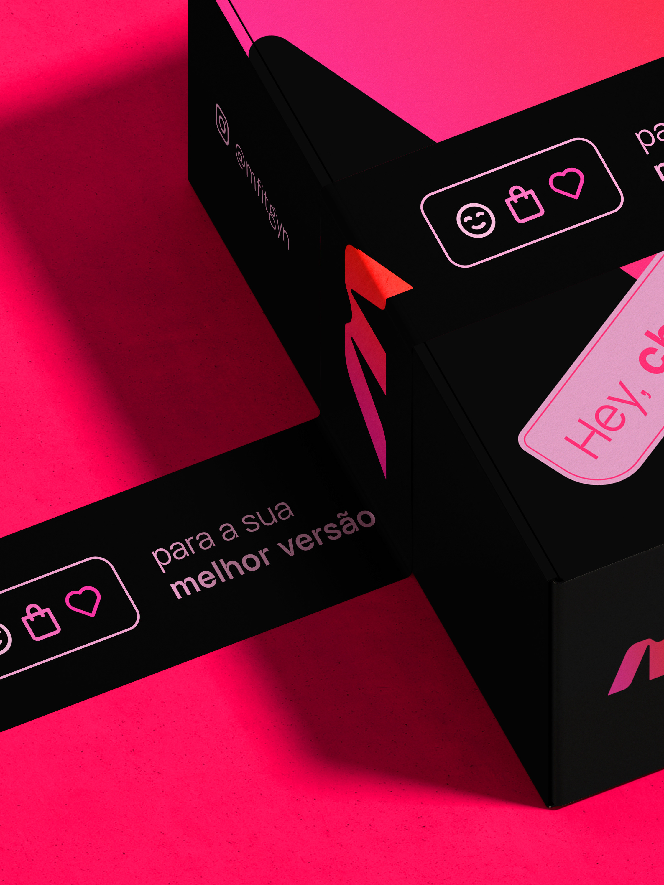
True Breeze . Brand Identity
EUA
True Breeze is an American air conditioning company. The company's need was to have a strong visual identity and different from its competitors. The creation of the Logo was classified as Imagotype, because we use the symbol along with text. Running from the cliché, we created a very different symbol from other companies in the industry. The creation of the symbol was a combination of a house and the shape of the wind / air. The house symbolizes the place where families will have the greatest contact with their product. The wind / air symbolizes the freshness that the company's product will bring to people and we also connect with the word "Breeze" which means breeze / air. The characteristics of the brand are strong, reliable and serious. Through visual identity, we are able to take this to customers and when the brand is seen.
BR
True Breeze é uma empresa norte-americana no ramo de ar condicionados. A necessidade da empresa era ter uma identidade visual forte e diferente dos seus concorrentes. A criação do Logo foi classificado como Imagotipo, pois usamos o símbolo junto com texto. Correndo do cliché, criamos um símbolo bem diferente das demais empresas do ramo. A criação do símbolo foi uma junção de uma casa e a forma do vento/ar. A casa simboliza o lugar a onde as famílias terão o maior contato com o seu produto. O vento/ar simboliza o frescor que o produto da empresa irá levar para as pessoas e também conectamos com a palavra "Breeze" que significa brisa/ar. As caracteristicas da marca são forte, confiável e séria. Através da identidade visual, conseguimos levar isso para os clientes e quando a marca for vista.